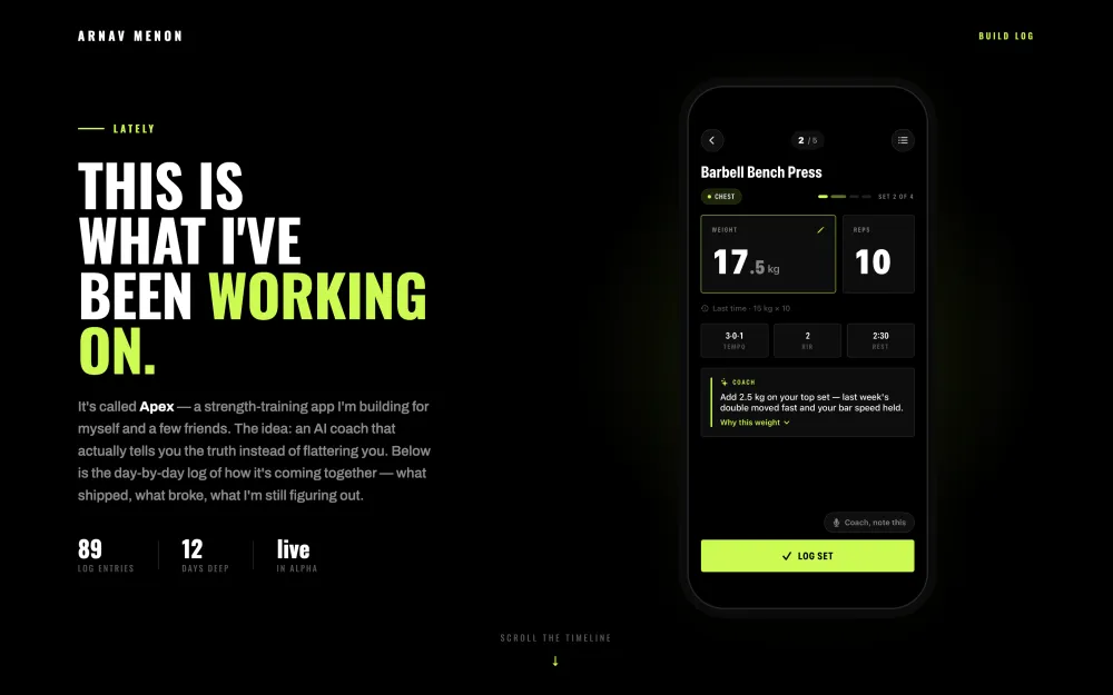
The design
process.
Every screen and every brand decision started as three or four options. Here's what I tried, what I cut, and what I kept — for both the app and this site.
Three directions for the workout screens
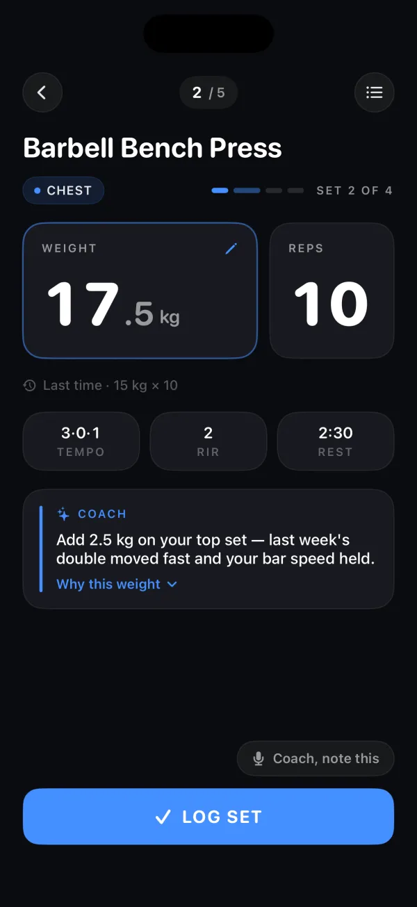
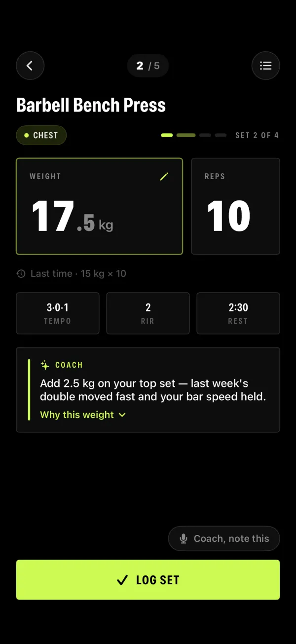
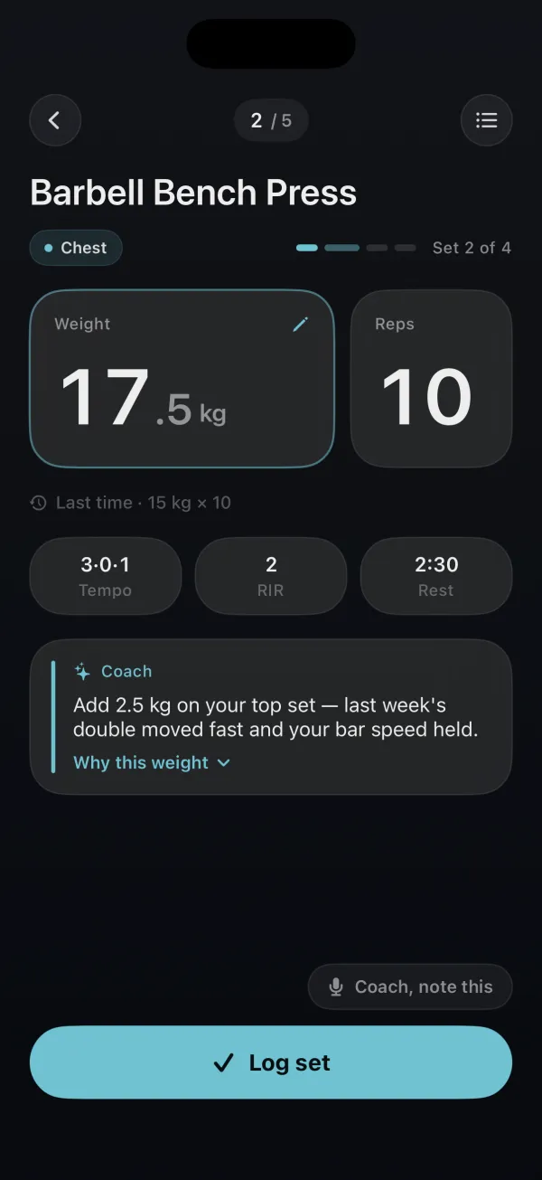
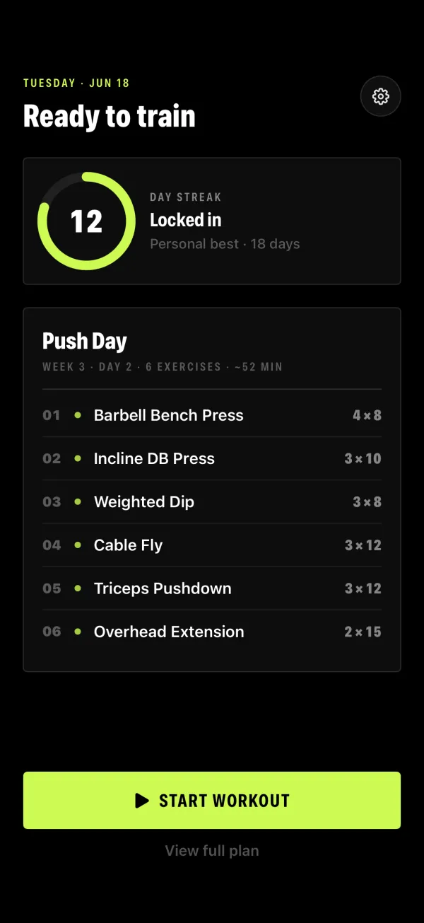
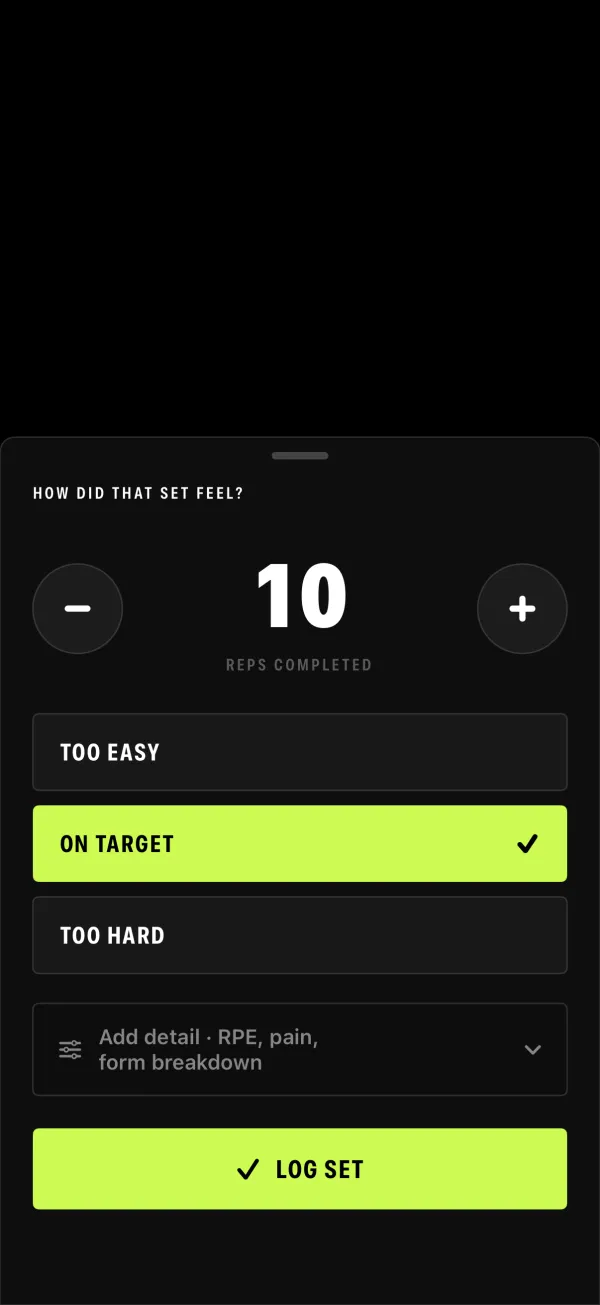
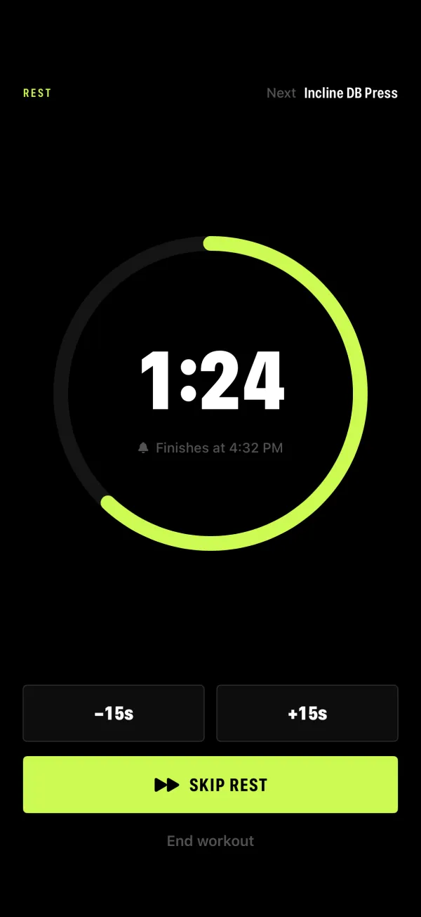
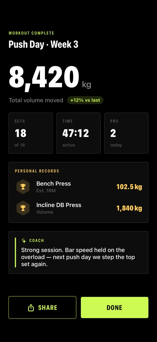
I built the same “do the set” screen three ways: a data-packed instrument panel, a stark brutalist look, and a softer calm one. The brutalist one won — it felt like a piece of gym kit, not a phone app.
Then I took that look everywhere
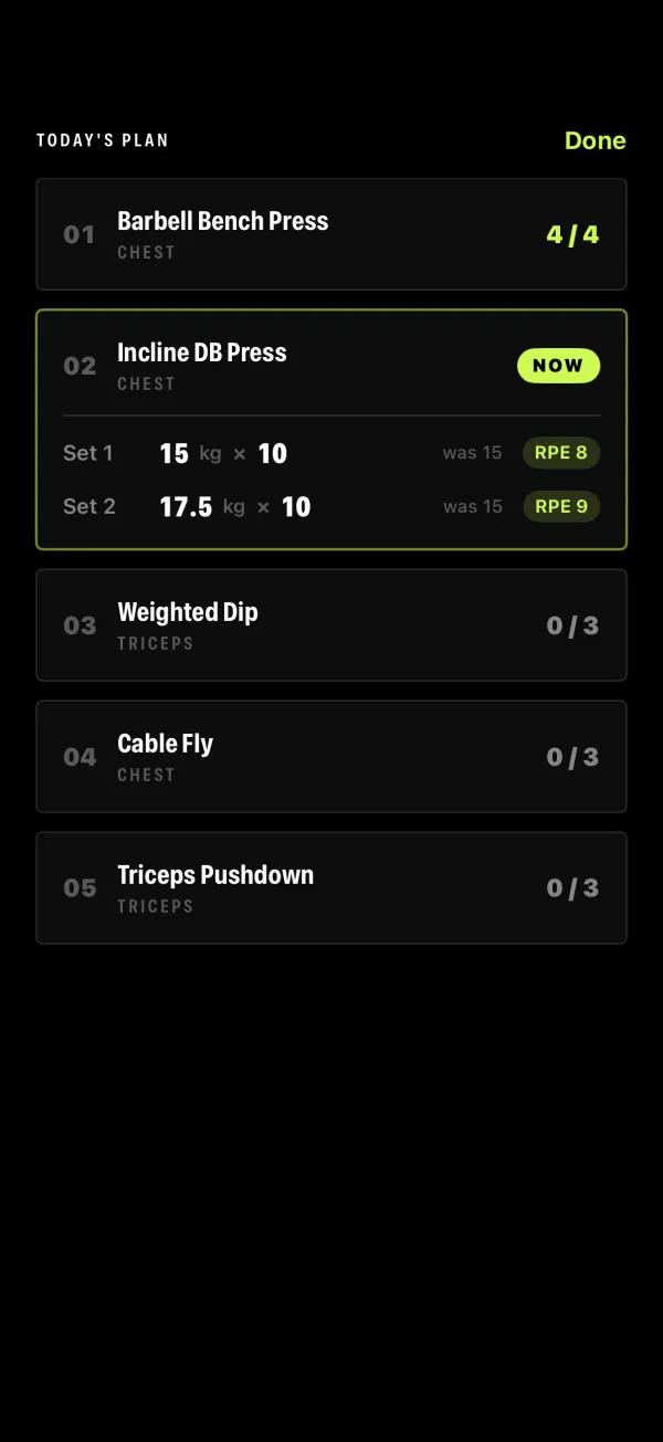
Once brutalist won I rebuilt the whole core flow in it — the plan, pre-workout, the live set, how it felt, the rest timer, the summary. Same black, same single lime accent, all the way through.
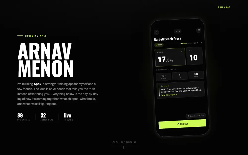
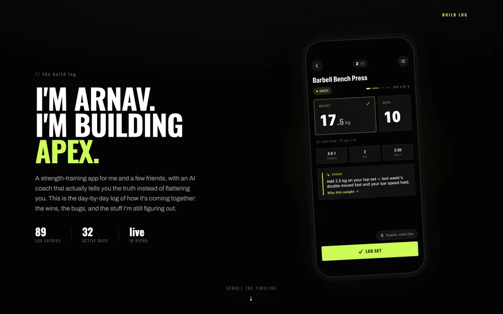
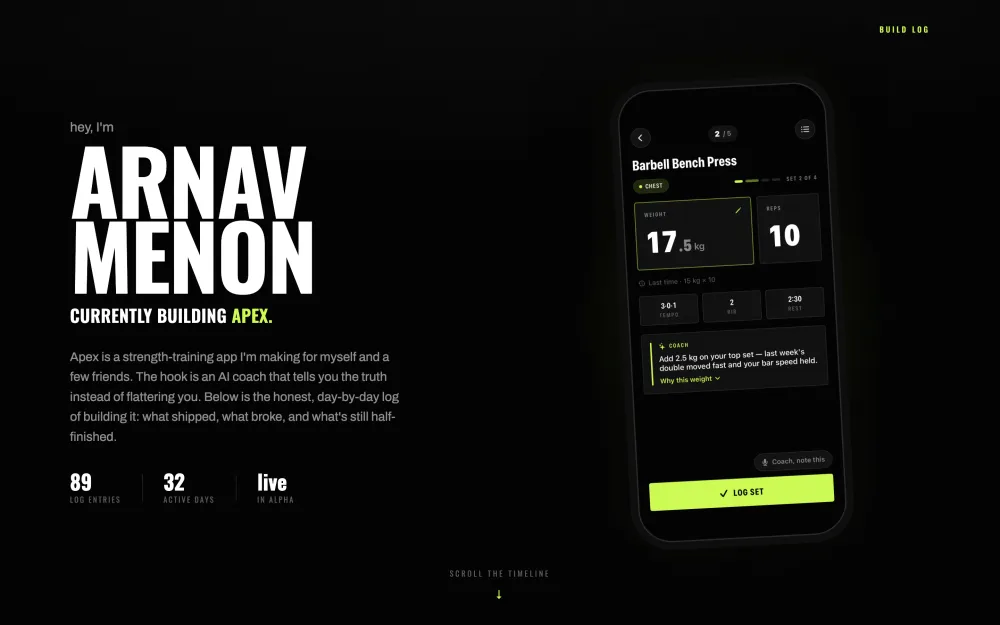
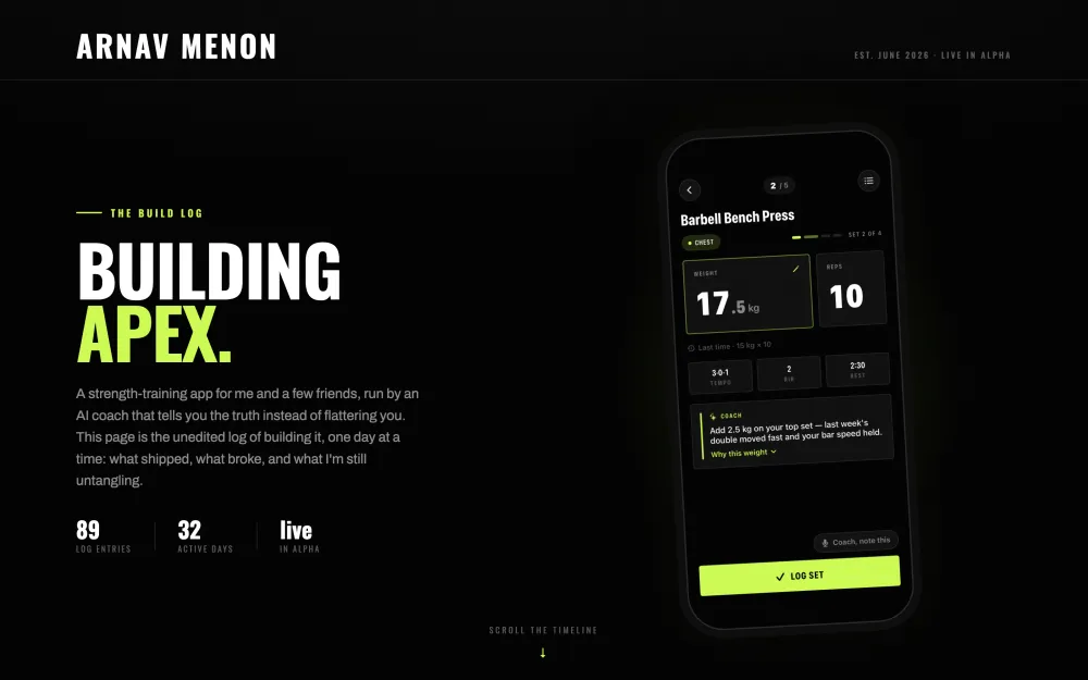
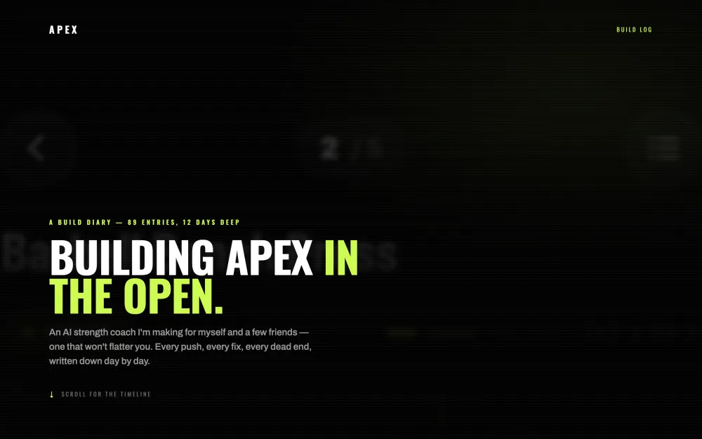
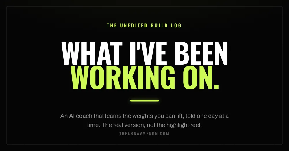
How loud should my name be?
For this page I tried putting myself front and center four ways — a nameplate, my name woven into the sentence, a giant surname, a magazine masthead. None felt right. So I cut the name and called it what it is: a build log.
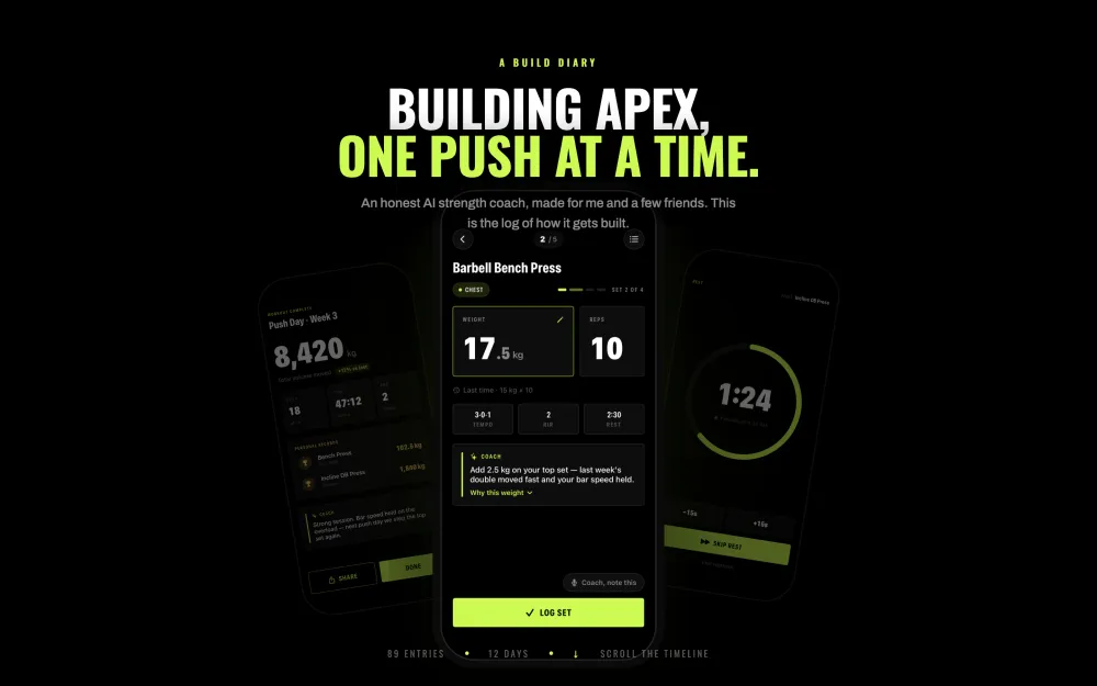
How the top of the page should feel
Three ways to arrange the first thing you see: the phone floating beside the pitch, a full-bleed hero, or a parallax scroll. I kept the floating one — it shows the app without shouting.
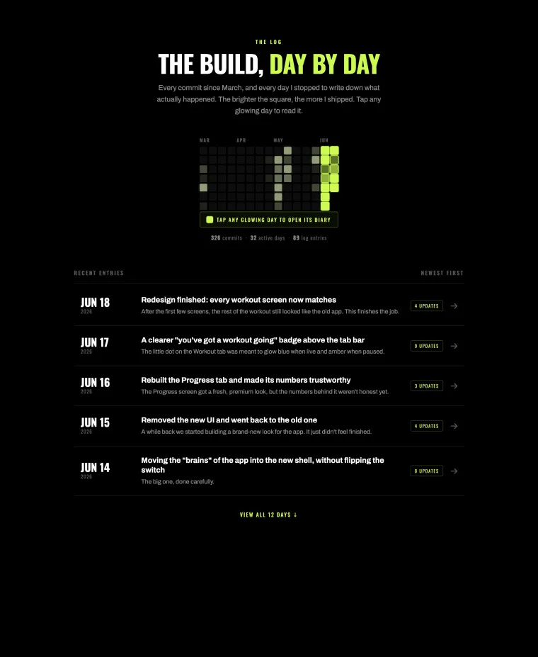
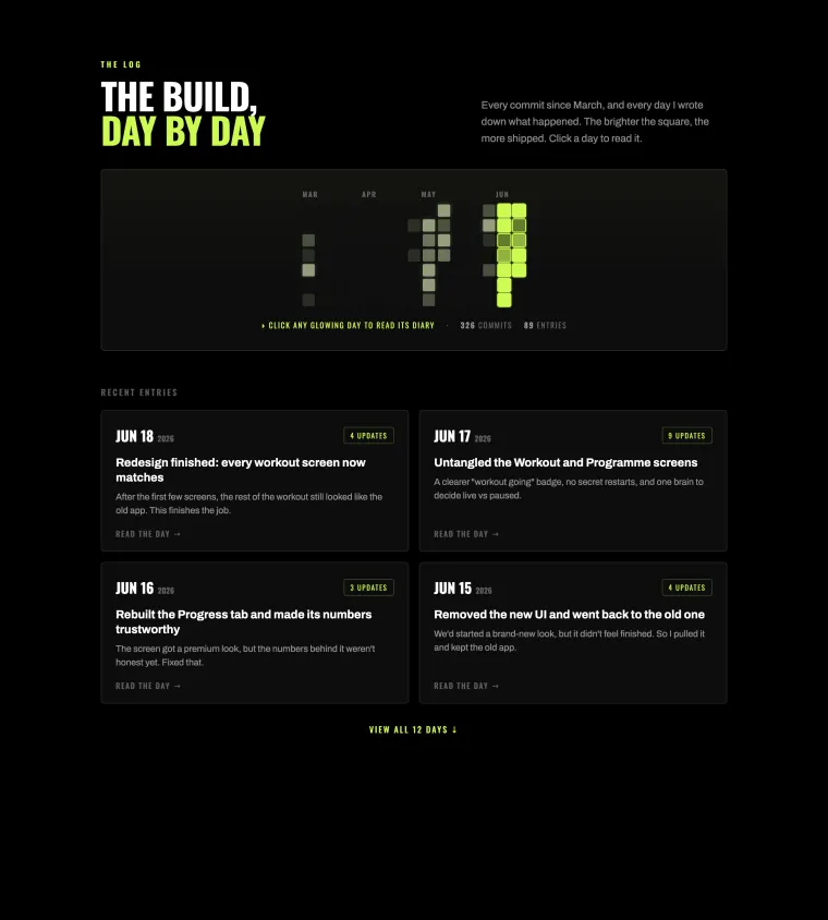
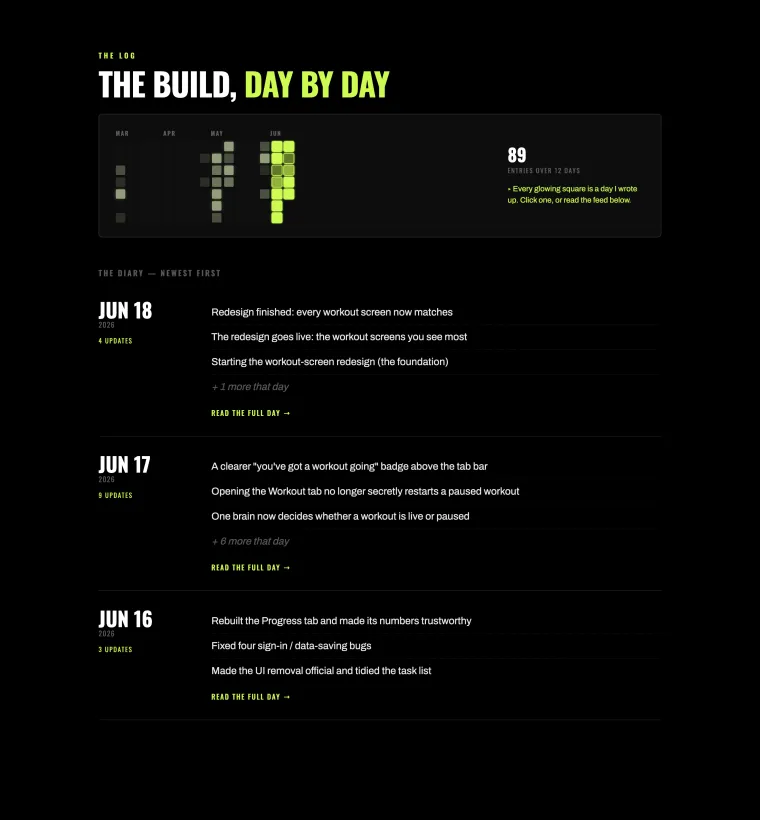
Showing the daily work
How to present the commit heatmap and the diary entries: a clean scannable list, a grid of cards, or an editorial feed. The centered heatmap plus a simple list won.
The image people see when they share a link
Three takes on the social preview: the literal product line, the heatmap signature, and a bold poster. The poster won.
The little icon in the browser tab
I crossed the heatmap's glowing-cell motif with a gym mark. A plain grid, a dumbbell over a grid, plate stacks, and a dumbbell cut out of a lime grid. The cut-out won.


That's the short version. The whole thing is still being built — follow along in the log.