2026.076 · Store
A menu made only of type.
Arnav Menon · Melbourne, 2026
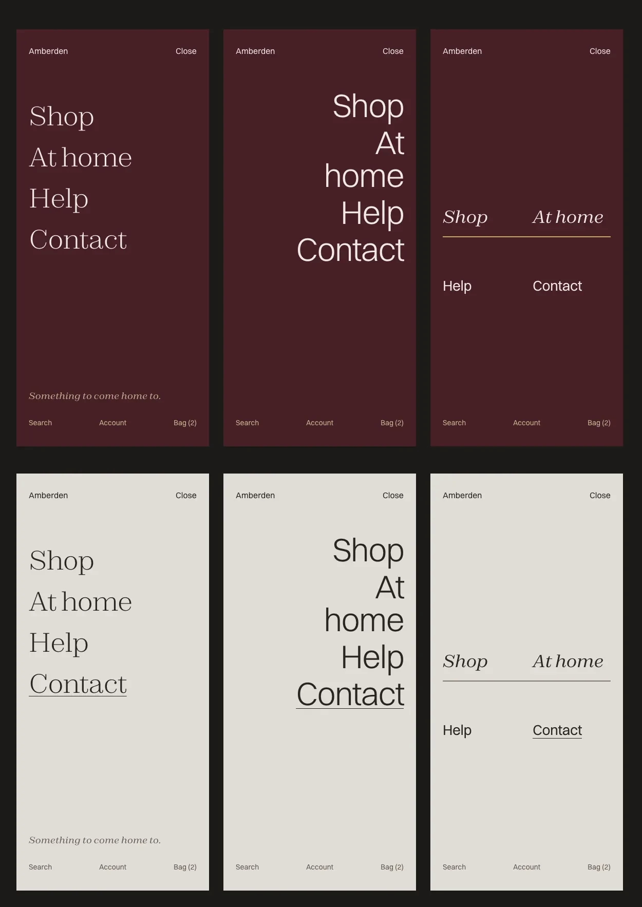
The first phone menu looked bad. I designed three new ones with no images, only type, each set in the site's real fonts on oxblood and on paper. The first was built, and the header on a phone became just Menu, the wordmark and Bag.
| Department | Store |
|---|---|
| Made | 14 September 2026 |
| Medium | Interface design for phones |
| Extent | 3 designs, 1 kept |
| Status | On viewamberden.com.au |
| Credit | Photography, direction, copy, design and build by Arnav Menon |
Related objects
Three designs
Three menus, one kept.
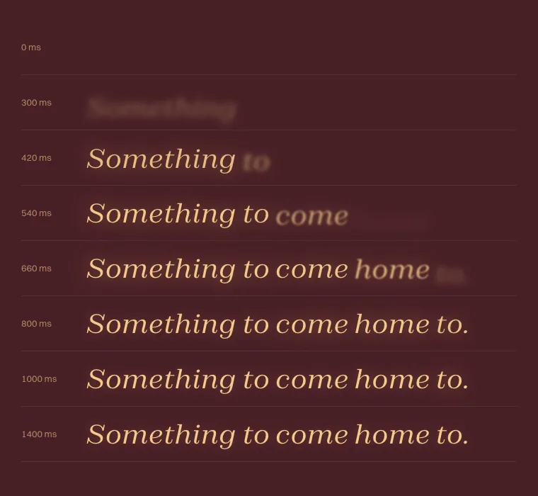
- AThe open page · keptFour links in Zodiak Light down one edge, a long pause, then “Something to come home to.” in italic at the foot.
- BThe folded lineVery large, light Switzer, set right. “At home” breaks over two lines on purpose, so the ragged edge becomes the design.
- CThe paired indexShop and At home in Zodiak italic, a hairline rule, then Help and Contact in Switzer.
The “← Dorado” shortcut back to the last lamp viewed went too, along with everything behind it.