2026.072 · Case study
Something to come home to.
Arnav Menon · Melbourne, 2026
Two days rewriting Amberden’s homepage. The copy explained itself, so I cut it. The page then felt empty, so I tried four layouts and kept the simplest. The voice came from the room the lamps were photographed in.
| Department | Case study |
|---|---|
| Made | 13–15 September 2026 |
| Medium | Copy, layout, type and motion for a live storefront |
| Extent | 10 chapters, 18 plates |
| Status | On viewamberden.com.au |
| Credit | Photography, direction, copy, design and build by Arnav Menon |
Contents
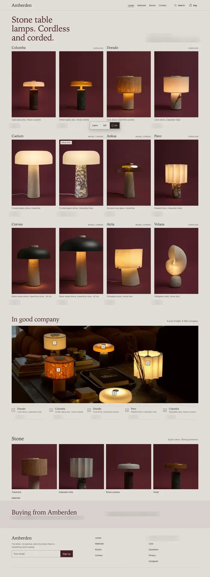
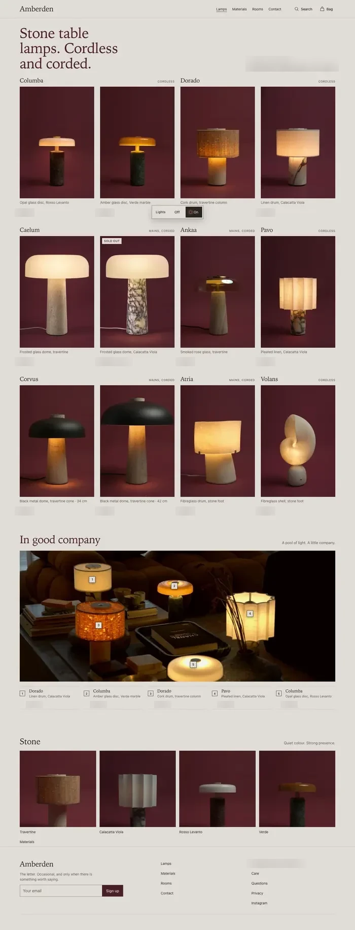
The first screen, before and after.
Cut what explains itself.
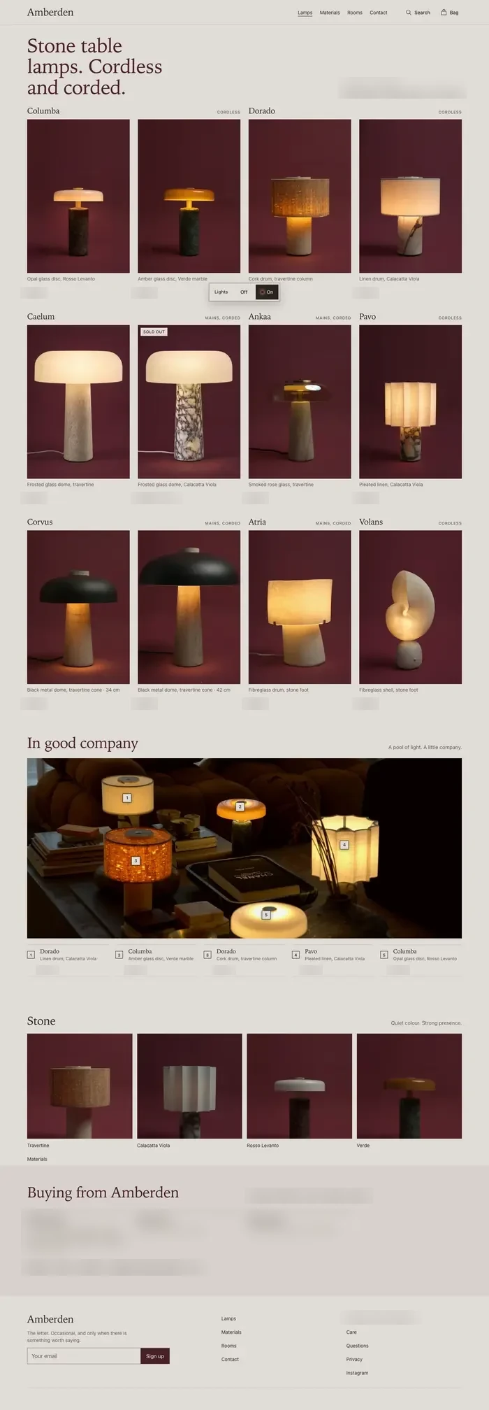
The homepage was carrying instructions and a count of the range before anyone had seen a lamp.
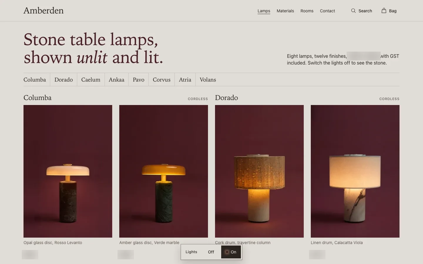
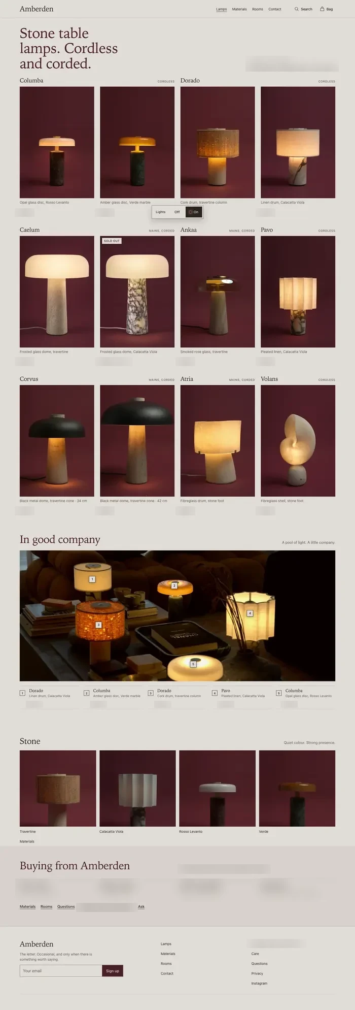
- 1Headline“Stone table lamps, shown unlit and lit.” The first screen now opens on the collection, with nothing written over it.
- 2The countA line that counted the range before anyone saw a lamp.
- 3The name rowEight names above a grid that already names every lamp.
A rewrite, still explaining.
I tried my first rewrite on the live page in the browser, so the type and photography were real. It cut the copy from 356 words to 300, and three variants followed. None of it sounded like the room the lamps were photographed in, so the next move wasn’t another draft. It was the voice.
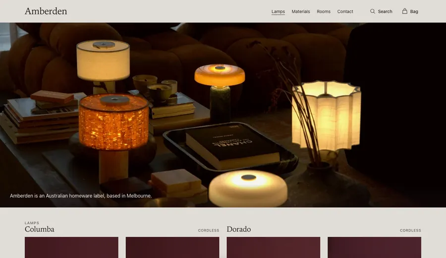
The answer was already in the photograph.
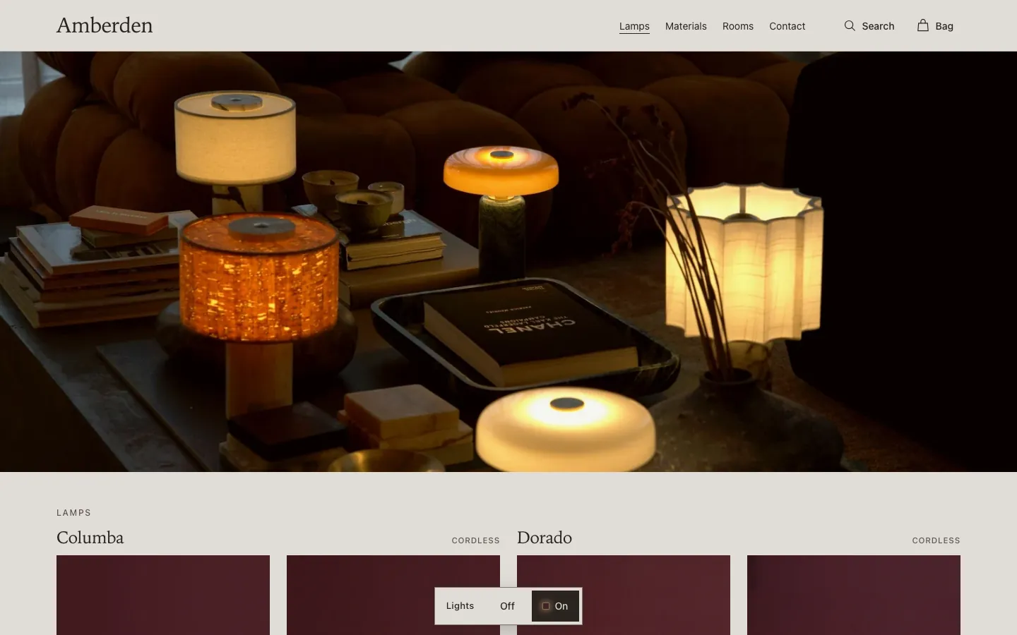
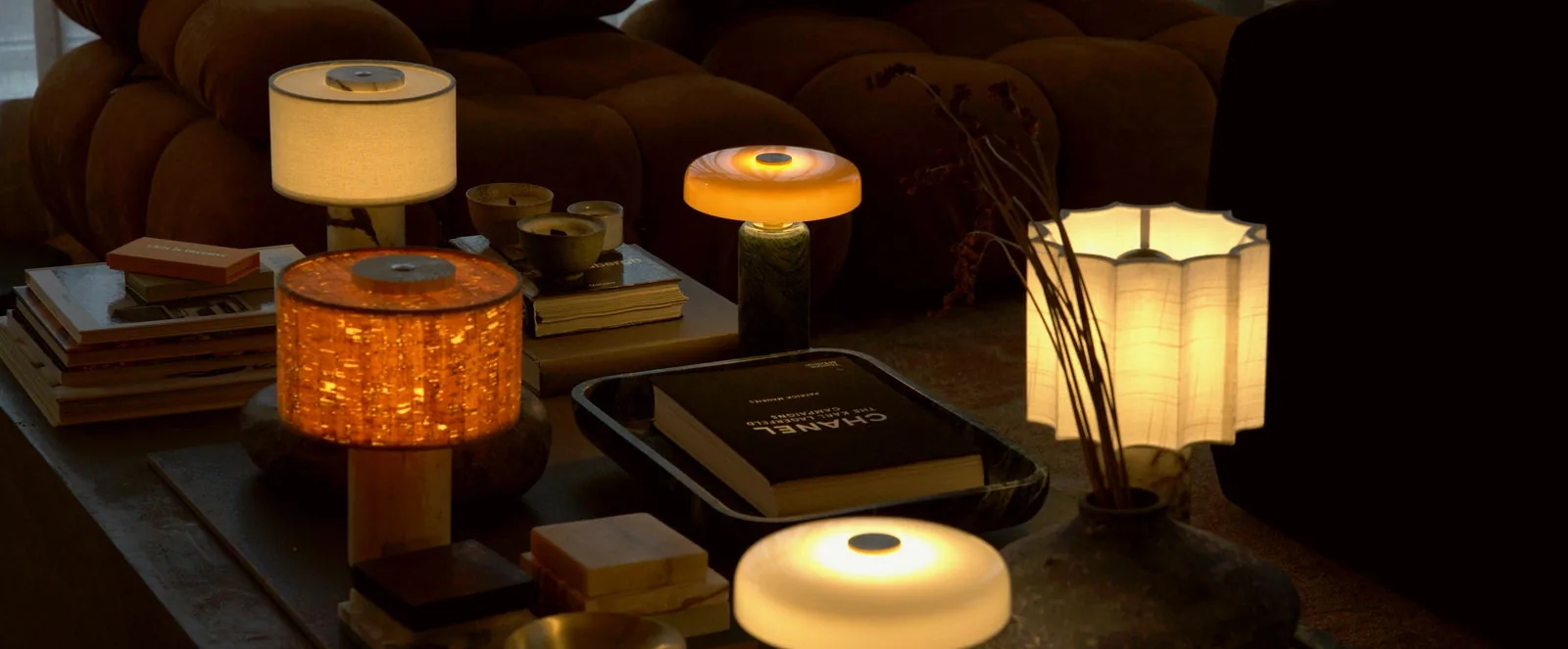
The copy was writing for a pale, minimal brand. The room the lamps were shot in is darker, plusher and more grown-up.
- 1A velvet sofa
- 2Dried branches
- 3Books, stacked
- 4Low amber light
- 5A dark room
Name the thing.Notice one true detail.Then stop.Never count the range.
Amberden is an Australian homeware label, based in Melbourne.
Plain and true. Everything written as a line was turned down, until the tagline.The page read empty.
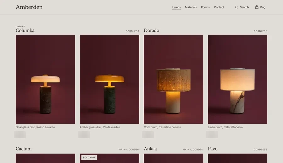
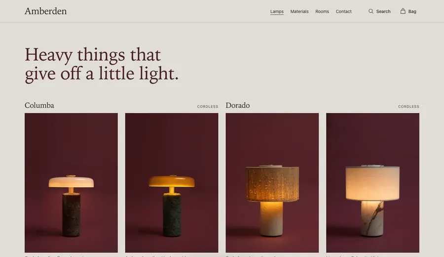
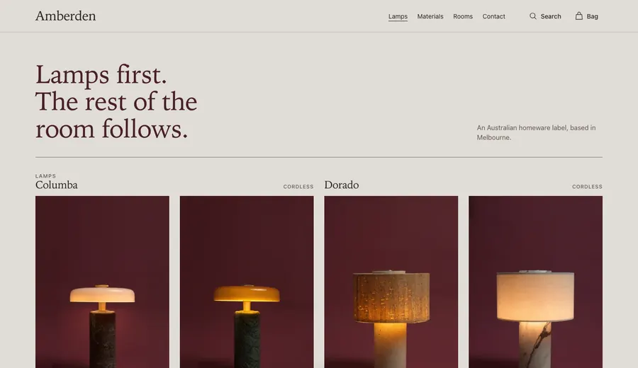
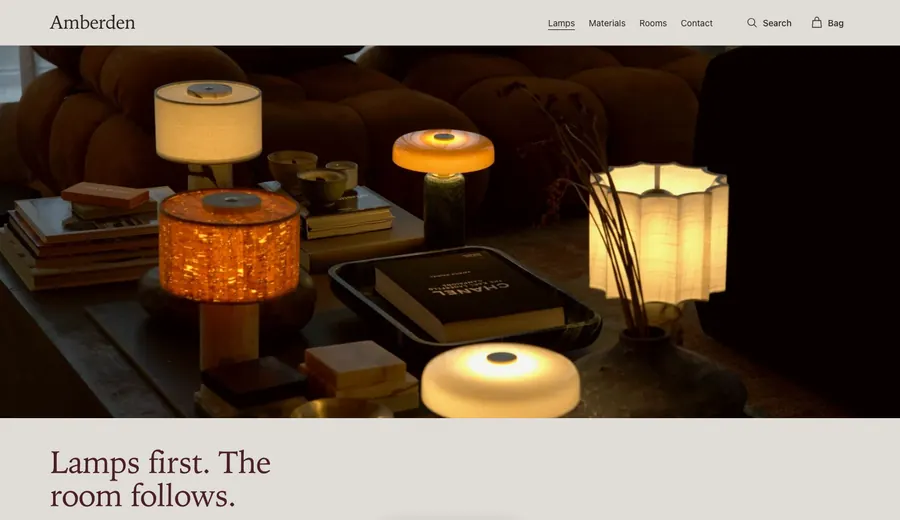
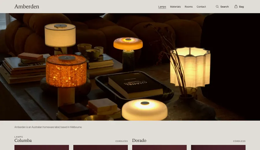
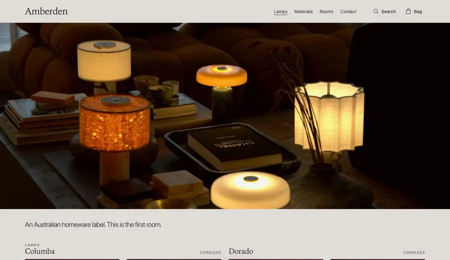
With the words out, the page felt thin. Four layouts, then a dozen places to put a single line, four of them shown here. What stayed was the simplest: the collection first, with nothing on it.
Six lines. One kept.
Written for the band above the footer, to sit beside the one plain sentence that had already been approved.
- Something to come home to.
- The home, one piece at a time.
- Things to live with.
- Room by room.
- A warmer room.
- For keeping.
Amberden is an Australian homeware label, based in Melbourne.
Plainer words at the edges.
The header and the footer were renamed around what someone shopping is actually looking for.
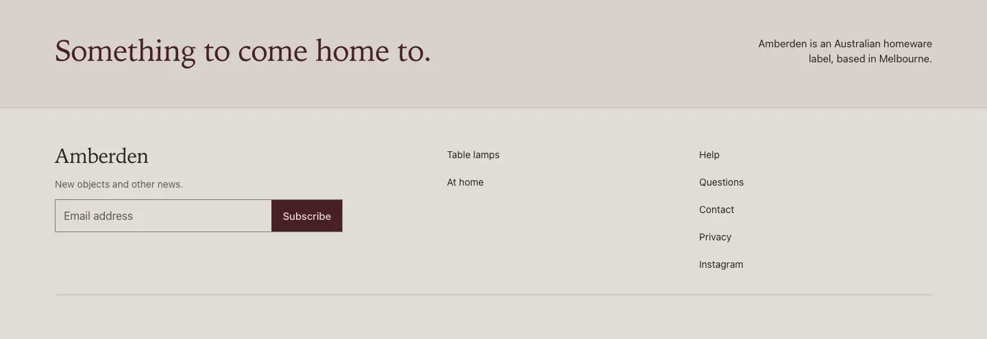
- 1The band“Something to come home to.” on the left, the Melbourne line on the right. It replaced a section called Around the room.
- 2NewsletterWas “The letter. Occasional, and only when there is something worth saying.” Now “New objects and other news.”
- 3ShopWas Lamps, Materials, Rooms and Contact. Now Table lamps and At home.
- 4HelpHelp, Questions, Contact, Privacy and Instagram.
A menu made only of type.
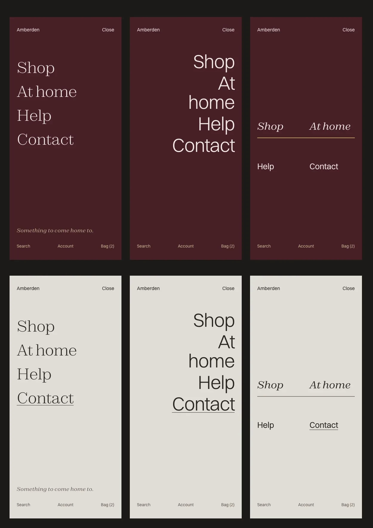
The first phone menu looked bad. I designed three new ones with no images, only type, set in the site’s real fonts, on oxblood and on paper.
- AThe open page · keptFour links in Zodiak Light down one edge, a long pause, then “Something to come home to.” in italic at the foot.
- BThe folded lineVery large, light Switzer, set right. “At home” breaks over two lines on purpose, so the ragged edge becomes the design.
- CThe paired indexShop and At home in Zodiak italic, a hairline rule, then Help and Contact in Switzer.
A was built. On a phone the header is now just Menu, the wordmark and Bag. The “← Dorado” shortcut back to the last lamp viewed went too, along with all the code behind it.
The line warms up.
Glow orange on oxblood, oxblood on paper. On paper the orange measured 1.2 to 1, which nobody can read, so it lives on the dark menu only.
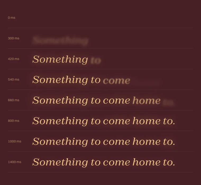
Somethingtocomehometo.
Somethingtocomehometo.
Something to come home to.
Each word rises out of a soft blur and blooms for a moment, like a filament coming on, then settles.
It starts once the menu’s links have risen, so the eye reaches the line last. Complete in under a second, and switched off for anyone who has asked their device for less motion.
- Opening the phone menu no longer rearranges the header. One word changes: Menu becomes Close.
- One bag across both rooms. A bag opened on a product page no longer breaks on the way home.
- Search, wired into the paper header.