2026.018 · Brand
Two rooms, two typefaces.
Arnav Menon · Melbourne, 2026
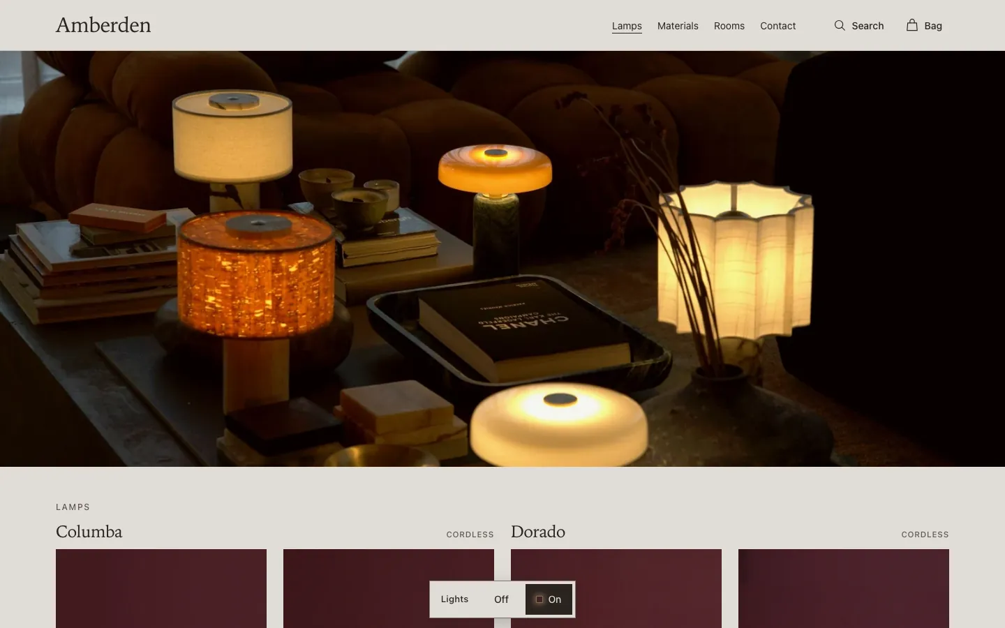
The oxblood was measured from the backdrop of the finished product shots, so the photographs sit on the page with no visible edge. Product pages stayed in that room; every other page moved to paper. Zodiak sets the headings, Switzer everything else.
| Department | Brand |
|---|---|
| Made | 18 August – 11 September 2026 |
| Medium | Colour and type |
| Extent | 5 colours, 2 typefaces |
| Status | On viewamberden.com.au |
| Credit | Photography, direction, copy, design and build by Arnav Menon |
Contents
The rooms
Oxblood for the lamps, paper for the rest.
Colours that carry text were checked for contrast on the ground they sit on. The glow only works in the dark room.
- Oxblood#482026Product pages, and ink on paper at 10.2 : 1
- Paper#E0DCD7Every other page
- Ink#2A2320Text on paper at 11.3 : 1
- Glow#F6C98AText on oxblood at 9 : 1, never on paper
- Brass#C9B896Labels on oxblood at 7.1 : 1
The typefaces
A logotype that stands alone.
Headlines first shared the logotype's face, which then appeared thirteen times on one page. Moving headlines to their own face let the wordmark stand on its own.
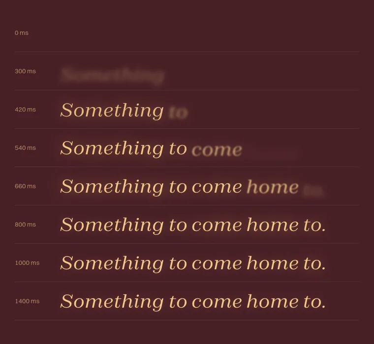
- Zodiak Light · HeadingsSomething to come home to.
- Zodiak Italic · The warm end of a linehome to.
- Switzer · Body text, navigation and labelsA homeware label from Melbourne.